Plot Maps
Plot Maps
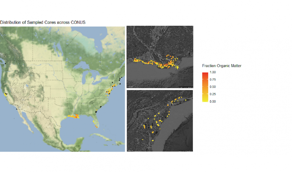
Let’s finish by creating more visuals; this time, a series of maps. The core_data tibble includes longitude and latitude of each soil core, so we can use those coordinates to plot where the cores were taken in geographical space:
    # Plot cores on a lat/long coordinate plane
    map <- ggplot() +
    geom_point(data = core_data, aes(x = core_longitude, y = core_latitude)) + # Add coordinate data
    theme_bw() + # Change the plot theme
    ggtitle("Distribution of Sampled Cores across CONUS") + # Give the plot a title
    xlab("Longitude") + # Change x axis title
    ylab("Latitude") # Change y axis title
    map

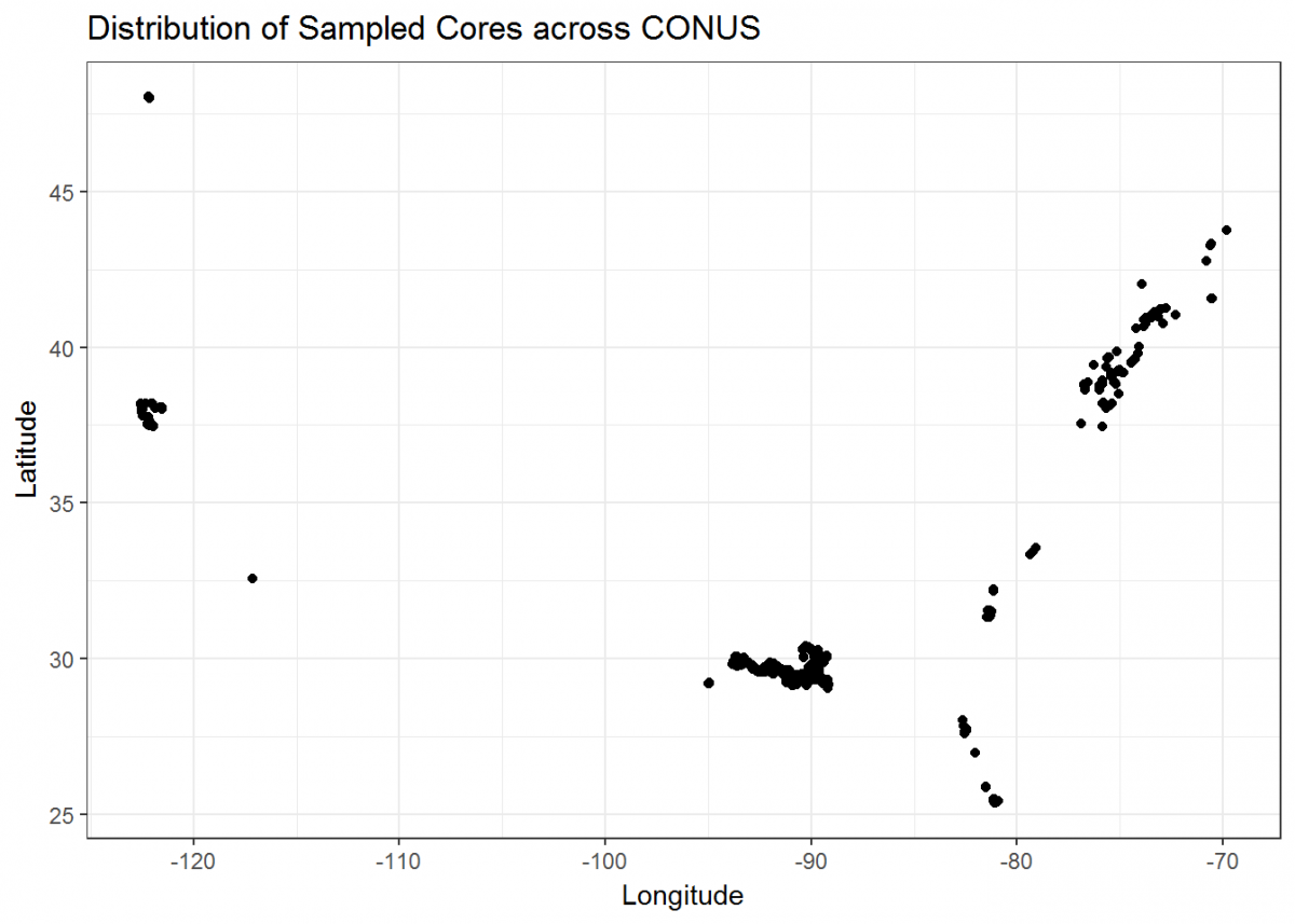
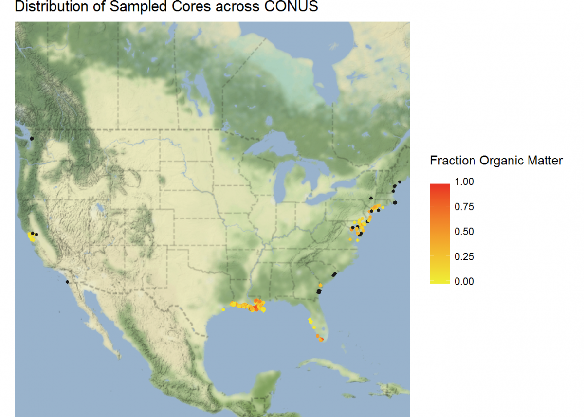
Not bad, but we can do more. Let’s plot a coordinate display of our cores overlayed on top of a map of the conterminous US, and display cores by a color gradient corresponding to the fraction of organic matter. We’ll use many of the operations that we learned in this tutorial all in sequence.
We’re also going to integrate a few packages that help with processing and displaying spatial data, rgdal and ggmap.
    # Load new packages
    devtools::install_github("dkahle/ggmap") # As of time of writing, this is a package that receives frequent
    # updates. So it's good to install from GitHub
    library(ggmap)
    library(rgdal)

    # Join core_data and depthseries_data
    core_depth_data <- left_join(core_data, depthseries_data, by = NULL)

    # Select coordinate data from core_data and redefine into new dataset
    core_coordinates <- select(core_depth_data, core_longitude, core_latitude, fraction_organic_matter)


    # Add Google Maps image of CONUS to plot
    CONUS_map <- get_map(location = c(lon = -96.5795, lat = 39.8283), # center map on CONUS
    color = "color",
    source = "google",
    maptype = "terrain-background",
    zoom = 4) # set the zoom to include all data

    # Add the CONUS_map with axes set as Longitude and Latitude
    ggmap(CONUS_map,
    extent = "device",
    xlab = "Longitude",
    ylab = "Latitude") +

    # Add core lat/long coordinates as points, colored by fraction organic matter
    geom_point(data = core_coordinates, aes(x = core_longitude, y = core_latitude, color =
    fraction_organic_matter), alpha = 1, size = 1) +
    scale_color_gradientn("Fraction Organic Matter\n",
    colors = c("#EFEC35", "#E82323"), na.value = "#1a1a1a") + # Provide ggplot2 with color gradient
    ggtitle("Distribution of Sampled Cores across CONUS") + # Give the plot a title
    xlab("Longitude") + # Change x axis title
    ylab("Latitude") # Change y axis title

    # Filter to specific regions for map insets

    # Add inset of Coastal Louisiana
    LA_map <- get_map(location = c(lon = -91.0795, lat = 30.2283),
    color = "bw",
    source = "google",
    maptype = "satellite",
    zoom = 7)

    # Add the LA_map with axes set as Longitude and Latitude
    ggmap(LA_map,
    extent = "device",
    xlab = "Longitude",
    ylab = "Latitude") +

    # Add core lat/long coordinates as points, colored by fraction organic matter
    geom_point(data = core_coordinates, aes(x = core_longitude, y = core_latitude, color =
    fraction_organic_matter), alpha = 1, size = 2) +
    scale_color_gradientn("Fraction Organic Matter\n",
    colors = c("#EFEC35", "#E82323"), na.value = "#1a1a1a") # Provide ggplot2 with color gradient

    # Add inset of Mid-Atlantic Seaboard
    mid_Atlantic_map <- get_map(location = c(lon = -75.095, lat = 39.2283),
    color = "bw",
    source = "google",
    maptype = "satellite",
    zoom = 7)

    # Add the mid_Atlantic_map with axes set as Longitude and Latitude
    ggmap(mid_Atlantic_map,
    extent = "device",
    xlab = "Longitude",
    ylab = "Latitude") +

    # Add core lat/long coordinates as points, colored by fraction organic matter
    geom_point(data = core_coordinates, aes(x = core_longitude, y = core_latitude, color =
    fraction_organic_matter), alpha = 1, size = 3) +
    scale_color_gradientn("Fraction Organic Matter\n",
    colors = c("#EFEC35", "#E82323"), na.value = "#1a1a1a") # Provide ggplot2 with color gradient

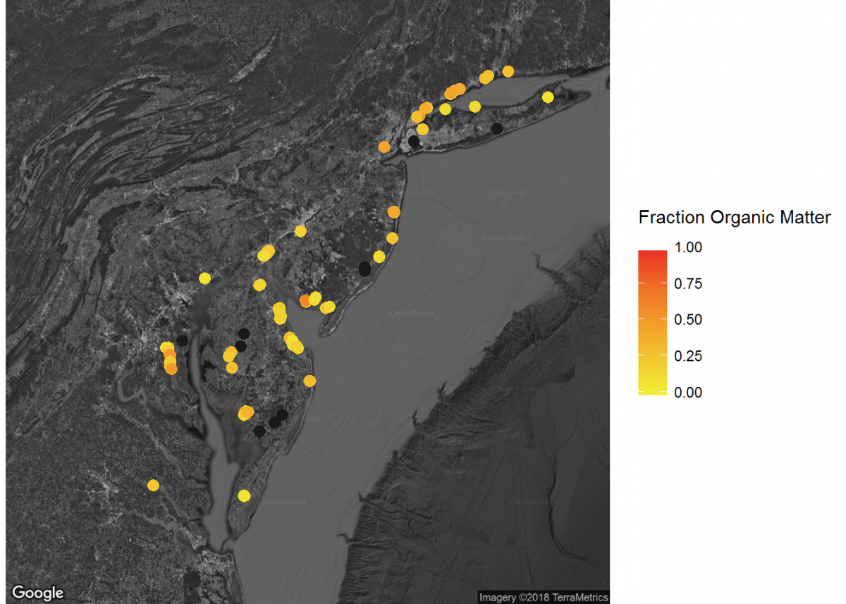
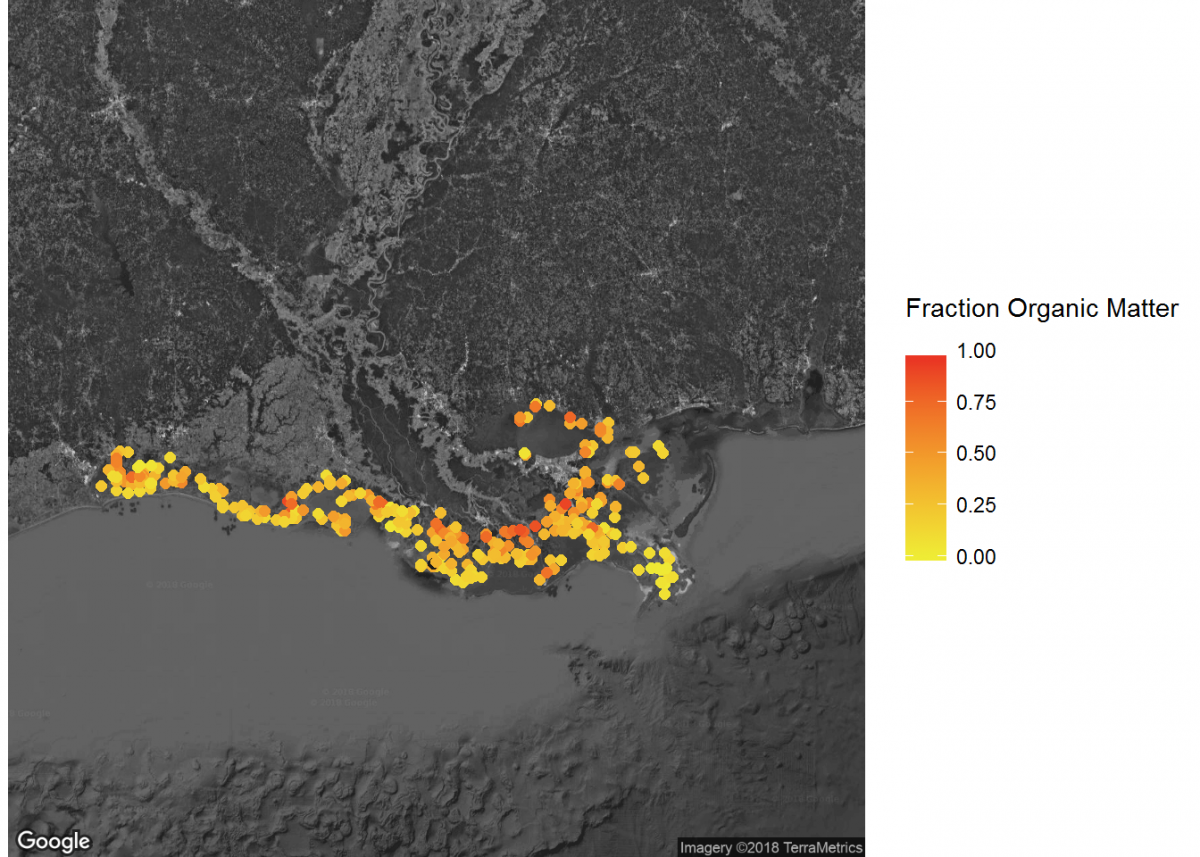
When combined, these maps can tell a lot about soil carbon across the contiguous United States.
Last Page Return to Top Next Page
