Plot a Histogram
Plot a Histogram
Now we will use these skills in unison to create a plot of our data. For this, we will use the ggplot2 package, also part of the tidyverse. The template for visualizations generated by ggplot involve base inputs through the ggplot() operation, followed by aesthetics added with aes() and layouts generated with theme(). There is a vast array of kinds of plots we can create in R through ggplot, but we will start with a simple histogram of carbon density.
First, we must calculate carbon density. Some of the studies in our data calculated the fraction mass of the sample that is carbon, which is needed to calculate carbon density. However, not all studies included this calculation. We will need to estimate the fraction carbon from the fraction organic matter, using the quadratic formula derived by Holmquist et al (2018).
In order to accomplish this, we will create a function that estimates the fraction carbon using the Holmquist et al (2018) equation. Then, we will write an if-else statement: if a logical statement is TRUE, then an action is performed; if the statement is FALSE, a different action is performed:
# This function estimates fraction carbon as a function of fraction organic matter
estimate_fraction_carbon <- function(fraction_organic_matter) {

# Use the quadratic relationship published by Holmquist et al. 2018 to derive the fraction of carbon from the
# fraction of organic matter

  fraction_carbon <- (0.014) * (fraction_organic_matter ^ 2) + (0.421 * fraction_organic_matter) + (0.008)
  if (fraction_carbon < 0) {
    fraction_carbon <- 0 # Replace negative values with 0
  }
  return(fraction_carbon) # The product of the function is the estimated fraction carbon value
}

depthseries_data_with_carbon_density <- depthseries_data %>% # For each row in depthseries_data...
  mutate(carbon_density =
    ifelse(! is.na(fraction_carbon), # IF the value for fraction_carbon is not NA....
# Then a new variable, carbon density, equals fraction carbon * dry bulk density....
      (fraction_carbon * dry_bulk_density),
# ELSE, carbon density is estimated using our function
      (estimate_fraction_carbon(fraction_organic_matter) * dry_bulk_density)
    )
  )

glimpse(depthseries_data_with_carbon_density)
## Observations: 16,976
## Variables: 9
## $ study_id                <chr> "Boyd_2012", "Boyd_2012", "Boyd_2012",...
## $ core_id                 <chr> "BBRC_1", "BBRC_1", "BBRC_1", "BBRC_1"...
## $ depth_min               <int> 0, 4, 8, 12, 16, 20, 24, 28, 32, 36, 4...
## $ depth_max               <int> 2, 6, 10, 14, 18, 22, 26, 30, 34, 38, ...
## $ dry_bulk_density        <dbl> 0.28, 0.41, 0.40, 0.48, 0.54, 0.59, 0....
## $ fraction_organic_matter <dbl> 0.28, 0.23, 0.27, 0.20, 0.18, 0.16, 0....
## $ fraction_carbon         <dbl> NA, NA, NA, NA, NA, NA, NA, NA, NA, NA...
## $ fraction_carbon_type    <chr> NA, NA, NA, NA, NA, NA, NA, NA, NA, NA...
## $ carbon_density          <dbl> 0.03555373, 0.04328395, 0.04907624, 0....
All of our newly calculated carbon_density data is within a new column of the same name. Let’s compile this information into a visual using ggplot. For displaying the distribution of carbon density, a histogram will do.
# Create a histogram of carbon density
histo <- ggplot(data = depthseries_data_with_carbon_density, # Define dataset
       aes(carbon_density)) + # Define which data is displayed
       geom_histogram(bins = 100) # Determine bin width, and therefore number of bins displayed

histo
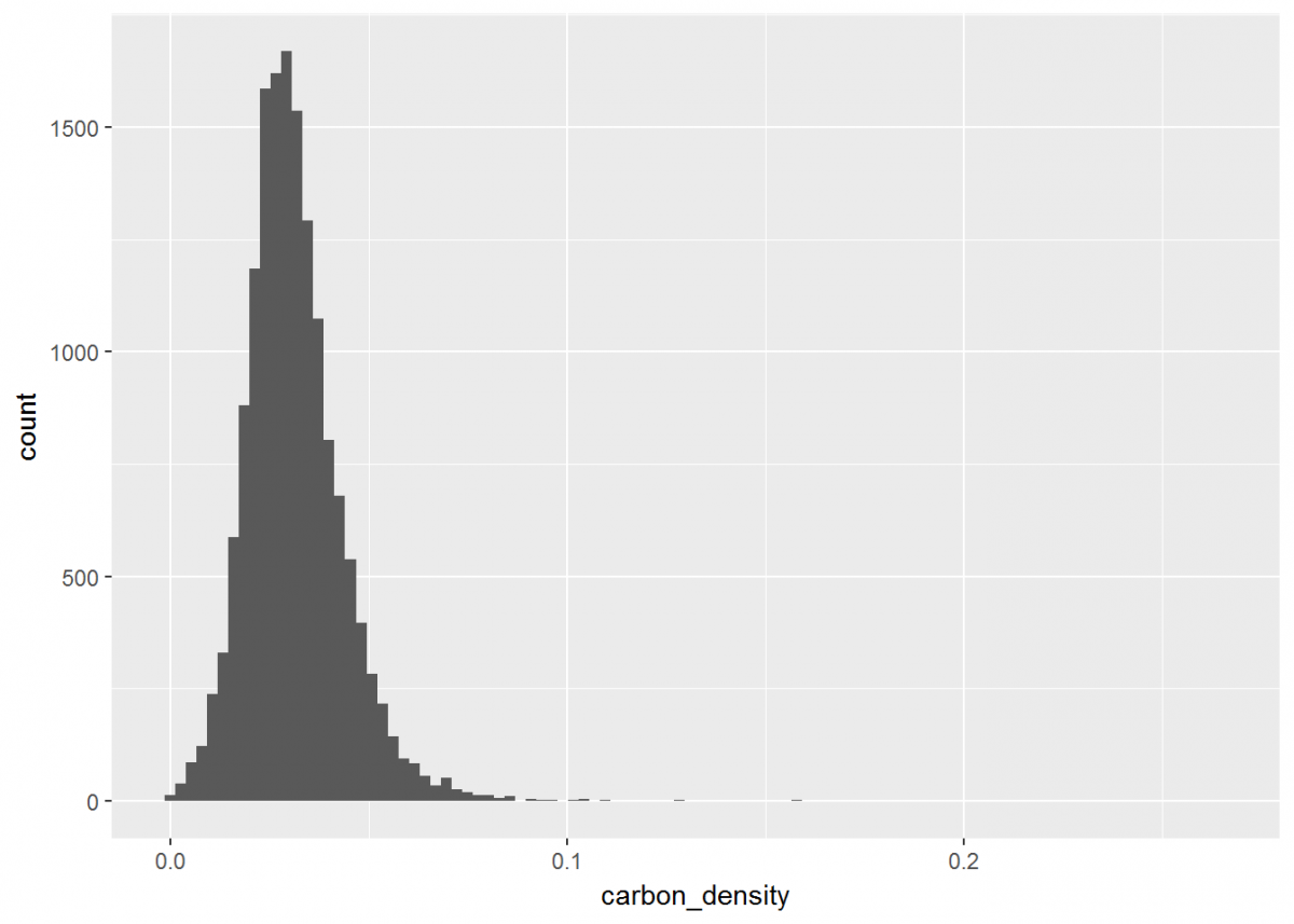
Notice how ggplot has its own notation that is different from dplyr, but the two packages are similar in that you can stack operations one after another. While dplyr uses the %>% notation, ggplot's syntax is a plus sign +. Also, you likely received a warning that rows containing non-finite values were removed. This is because ggplot recognized that some of our data was NA, and did not plot these entries.
Our plot could look a little better if the limit of the x-axis was reduced to fit the distribution…and let’s change the theme background and plot labels while we're at it.
# Update our histogram
histo <- histo + # Load the plot that we've already made
         xlim(0, 0.15) + # Change x-axis limit to better fit the data
         theme_classic() + # Change the plot theme
         ggtitle("Distribution of Carbon Density of CONUS") + # Give the plot a title (CONUS = contiguous US)
         xlab("Carbon Density") + # Change x axis title
         ylab("Number of Observations") # Change y axis title
histo
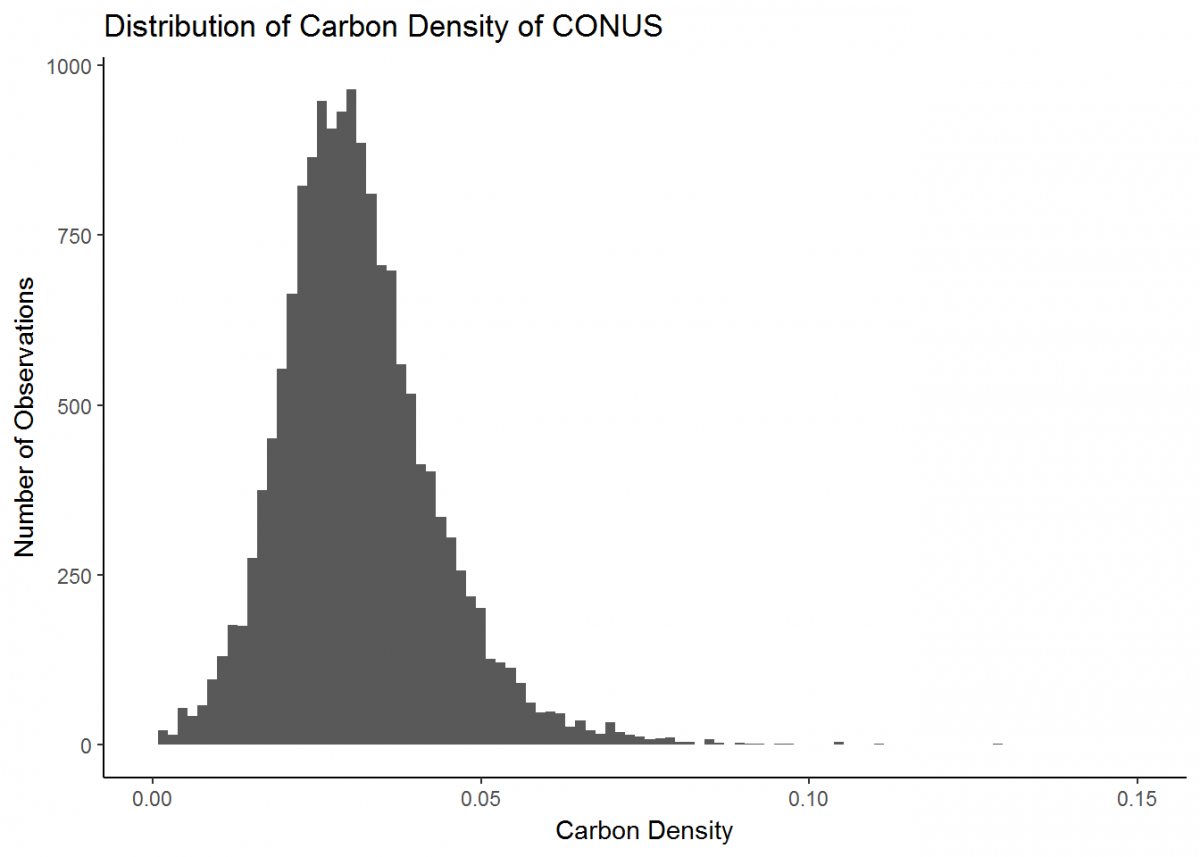
Great, much better. This is a basic plot of just one type of data. However, there is much more you can do with the functionality of ggplot (the ggplot cheatsheet provides some quick overview), and soon we will develop more intricate plots with multiple data types. But first, we’ll learn a couple new skills.
Last Page Return to Top Next Page